Visual Identity Design, Ti-Capital
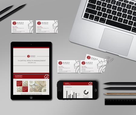
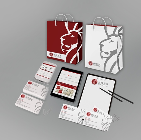
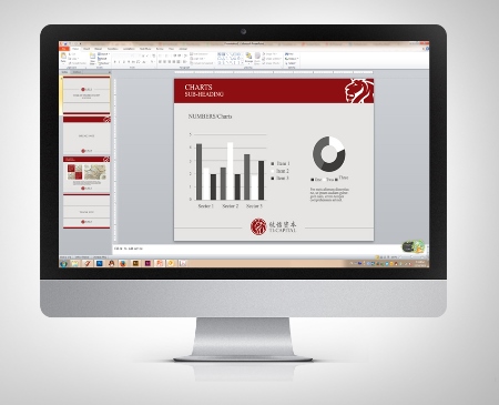
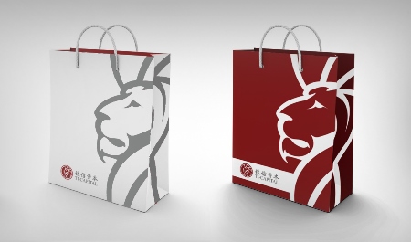
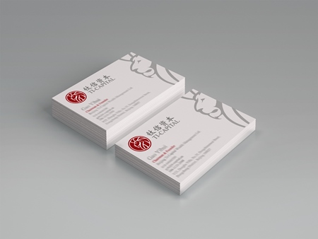
For a client developing a new wealth management brand 5 Star Plus Retail Design developed a visual design identity concept which included a brand logo, colors, typefaces, name cards, presentation template and a branded bag design.
The company's name is comprised of the Chinese characters "Titanium" and "Trust". This meant the visual design identity had to represent the organization as "clean, high-end, scientific, precious, stable, trustworthy, safe, and secure". All of which are Core values and characteristics to its founders. The logo had to be high-end, suited to the Chinese market, appear masculine and strong, and communicate the power and heritage that come from the founders' experience. It also had to be appropriate for a financial institution or private bank.
5 Star Plus Retail Design created a visual identity design concept in light grey, dark red and white with a lion as the logo's key element to express trust, authenticity, and a certain formality.
Back to Projects