Exhibition Stand Design,
AZO China
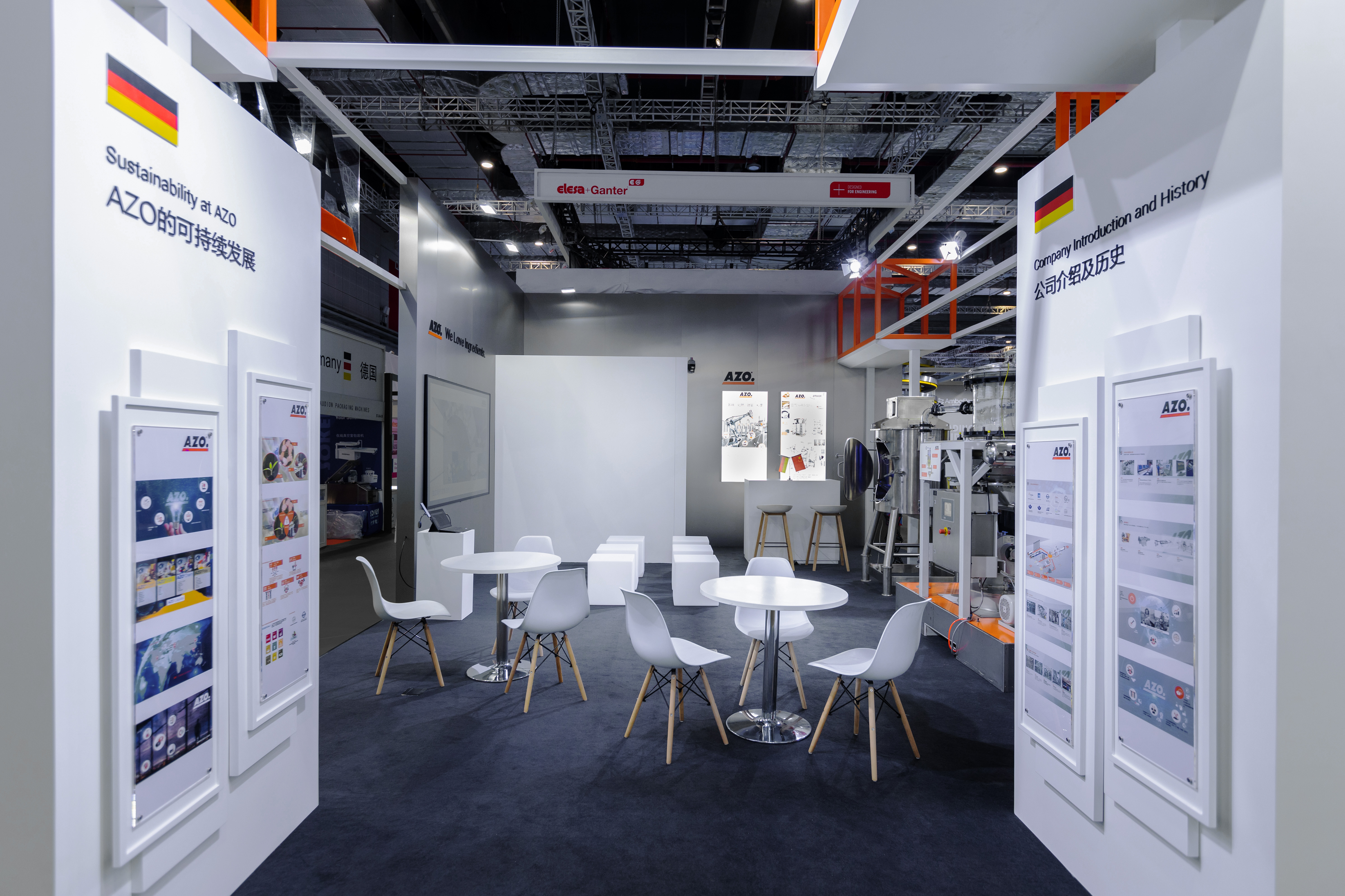
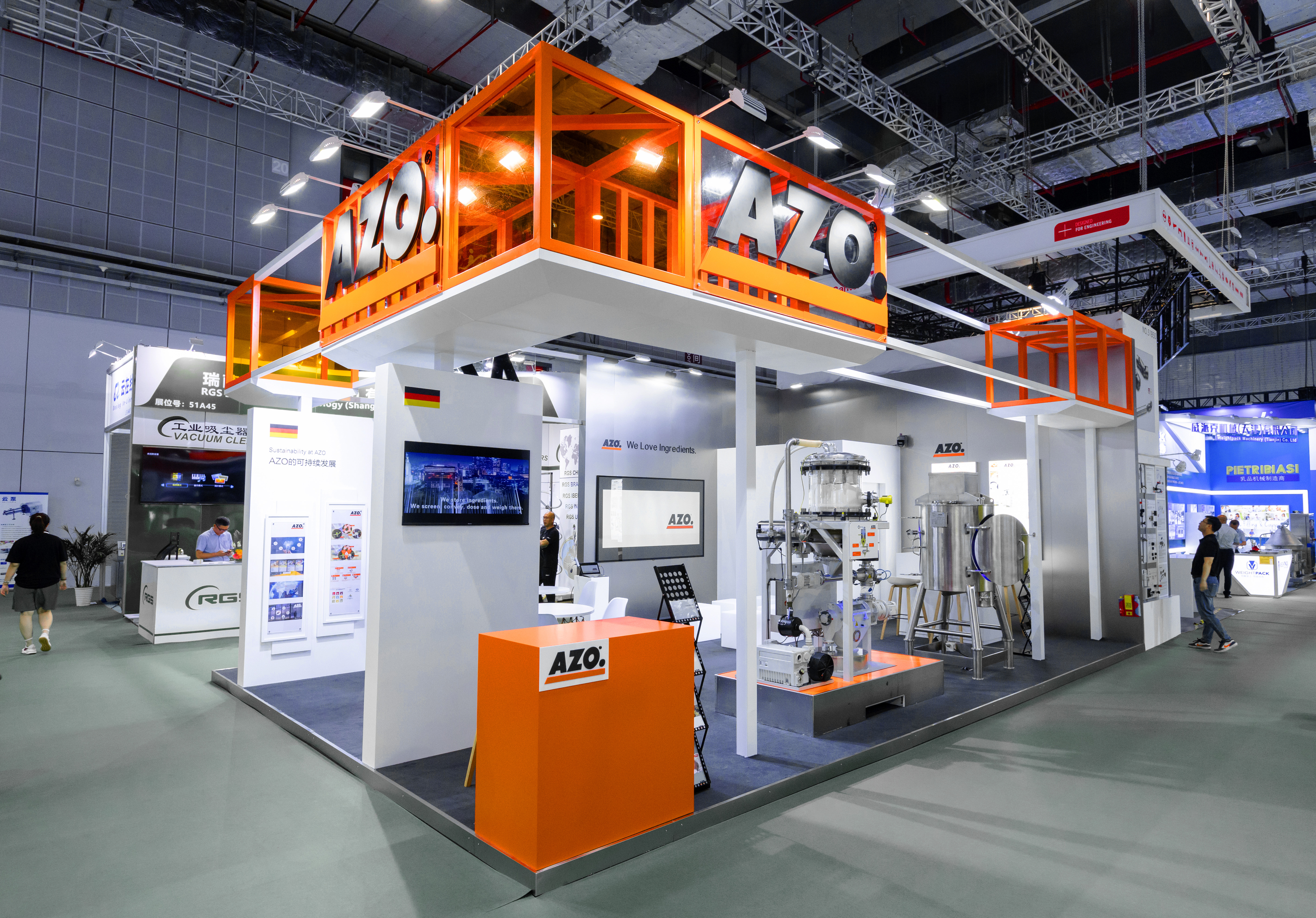
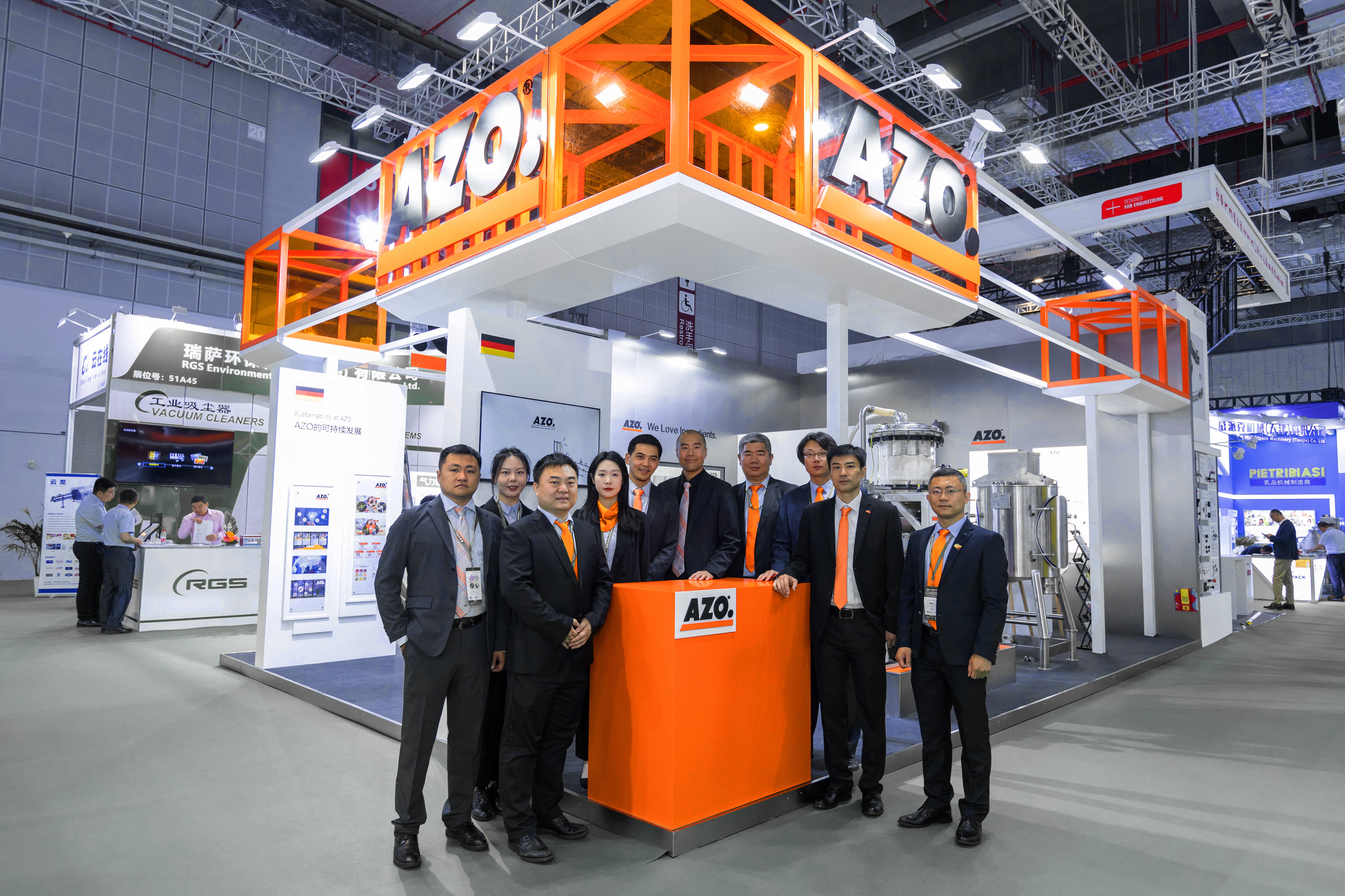
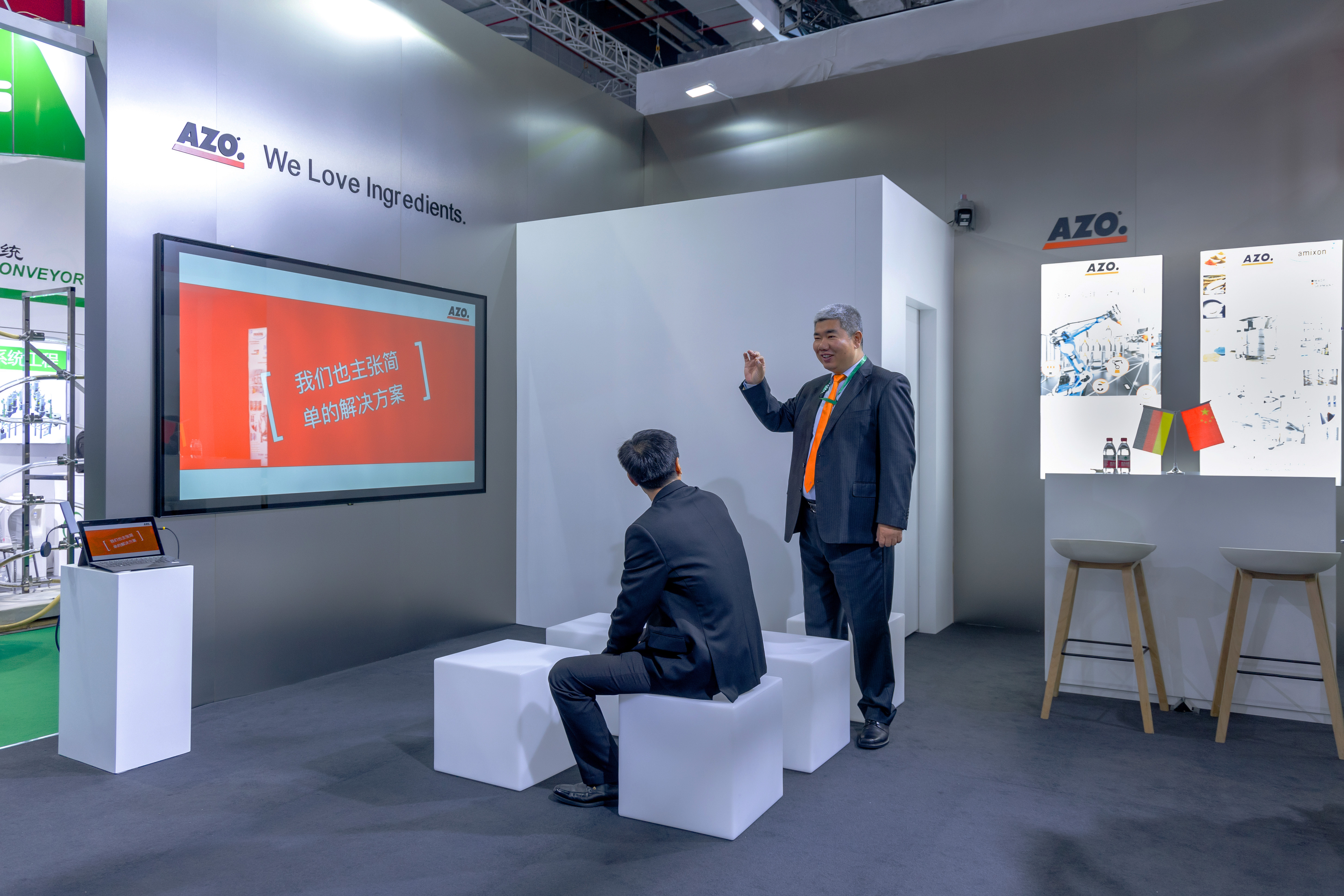
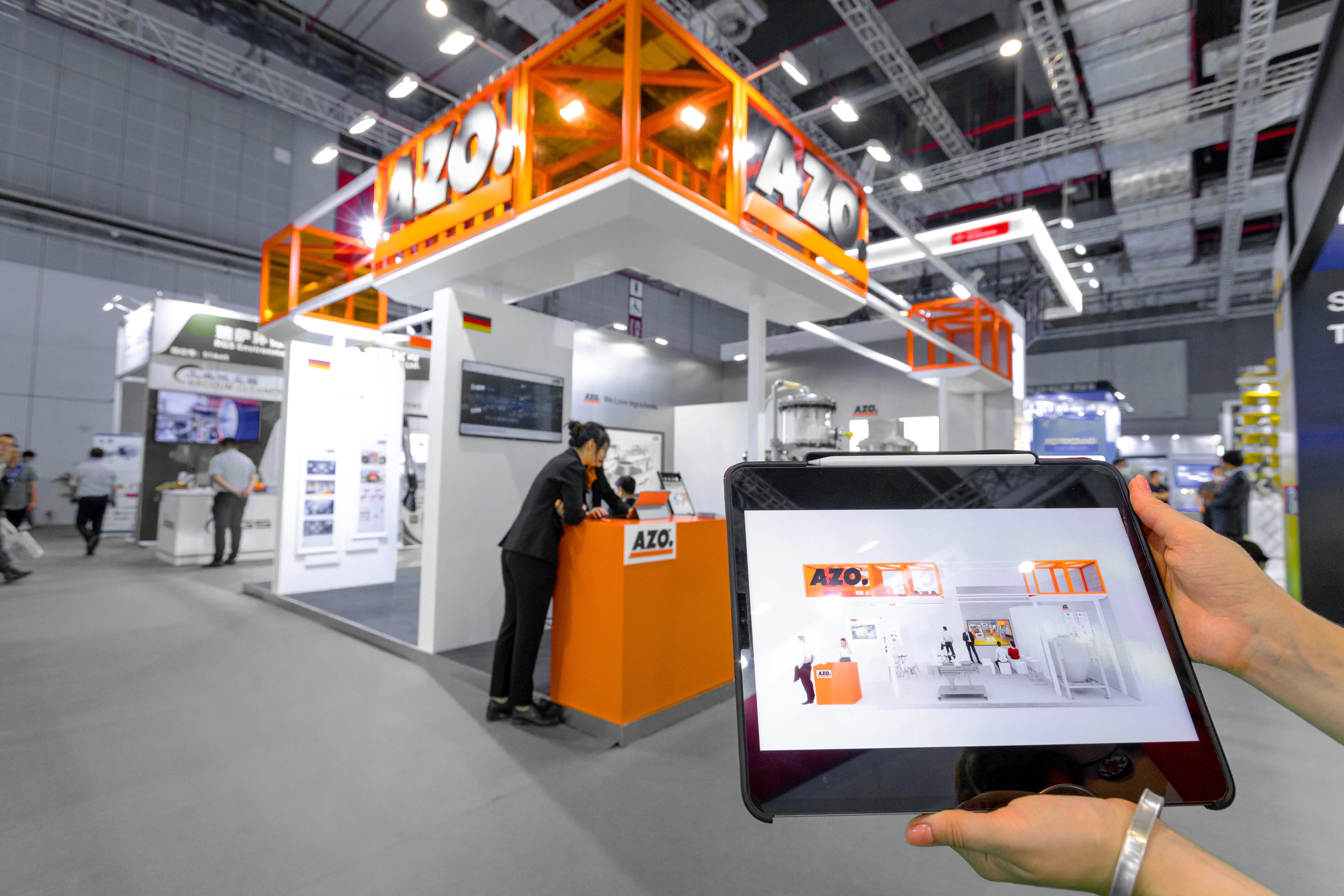
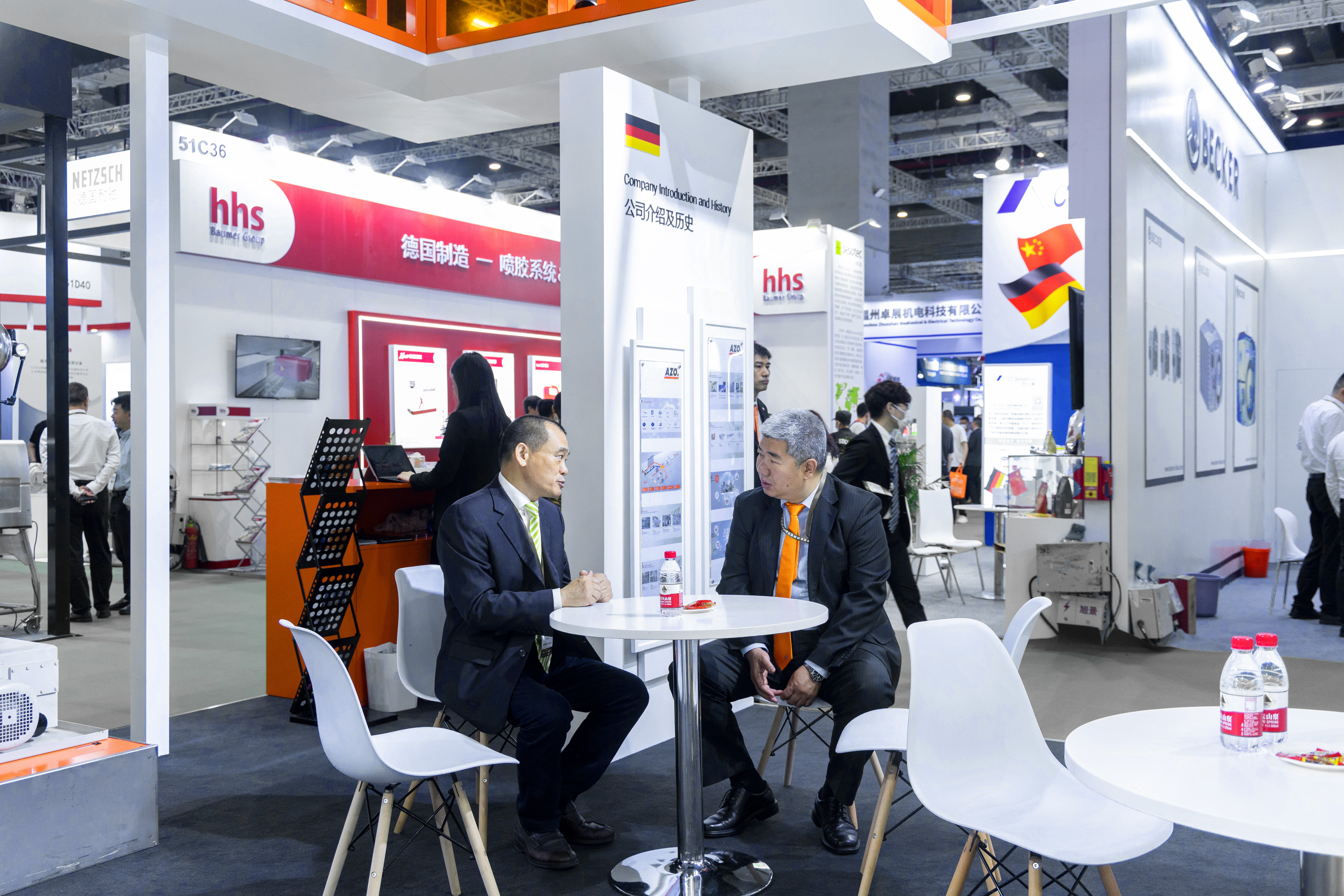
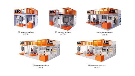
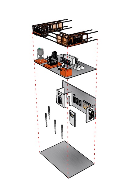
5 Star Plus Retail Design created a high-impact exhibition stand design standard for AZO China. The objective was to develop a flexible and modular stand design based on the global brand identity that could be adapted to different stand sizes at exhibitions in China. Reusing as many components as possible was crucial for AZO China to meet their sustainability principles. The concept had to showcase the quality of AZO’s products and their corporate culture through an aesthetically impressive yet minimalist design. Inspired by the company’s background, the design concept features a high-tech industrial feel with design elements resembling modern factories and warehouses. The brand colors orange and white were combined with aluminum and stainless-steel surfaces to reflect the industrial sector. The AZO logo and warehouse structures served as inspiration for the cubes - the feature elements of the stand design. The exhibition stand design is based on simple, clean lines that draw the focus to the stand’s most important areas: the story walls, the product showcase area, and the experience zone, which provide maximum customer experience. Orange platforms were used to highlight the products and attract attention. The result is an exhibition stand design where the atmosphere, messages, information visuals, multimedia, and points of interest are aligned to provide an authentic “AZO experience”.
Back to Projects